
This course project aims to improve the overall Green P experience by creating a more intuitive, consistent flow across street signs, payment machines, and the app, making parking in Toronto faster, easier, and more user-friendly.
What's the problem?
Toronto’s Green P Parking system is a core part of street parking, but paying can be frustrating because different machine models often have unclear instructions, outdated interfaces, and low-visibility screens—plus issues like payment failures, long waits, and limited payment options. These usability problems can increase driver stress and even lead to blocked streets or parking tickets.
How to solve?
We solve the problem by redesigning the Green P machine flow to reduce stress and errors. We focused on the top problem we identified in our research and developed solutions for each issue.
My Role:
Conducted user research to understand key pain points in the Green P parking experience
Analyzed research findings and synthesized actionable insights to guide design decisions
Created a user persona to represent core user needs, goals, and frustrations
Designed high-fidelity prototypes to visualize and communicate the proposed solution
Platform
Kiosk Machine
Sector
transportation / urban mobility
Methodologies:
User research, Synthesis methods, Ideation methods, Iterative prototyping, Usability evaluation
Tools Used
Figma, Miro, Google Doc, Google Form
Skills Developed:
Wireframing, Prototyping, Problem-Solving, Empathy, Persona, Researching
Research Analysis
We analyzed the survey and interview data to identify recurring pain points and patterns, then synthesized the findings into key insights and user needs that directly informed our persona and design priorities.

As-Is Scenario
Persona
We've created this persona based on our research.

Ideation
During ideation, we brainstormed individually, then grouped and refined our ideas as a team, and used a prioritization grid to select the most impactful and feasible concepts to move forward into prototyping.

Prioritization Grid

Ideas picked
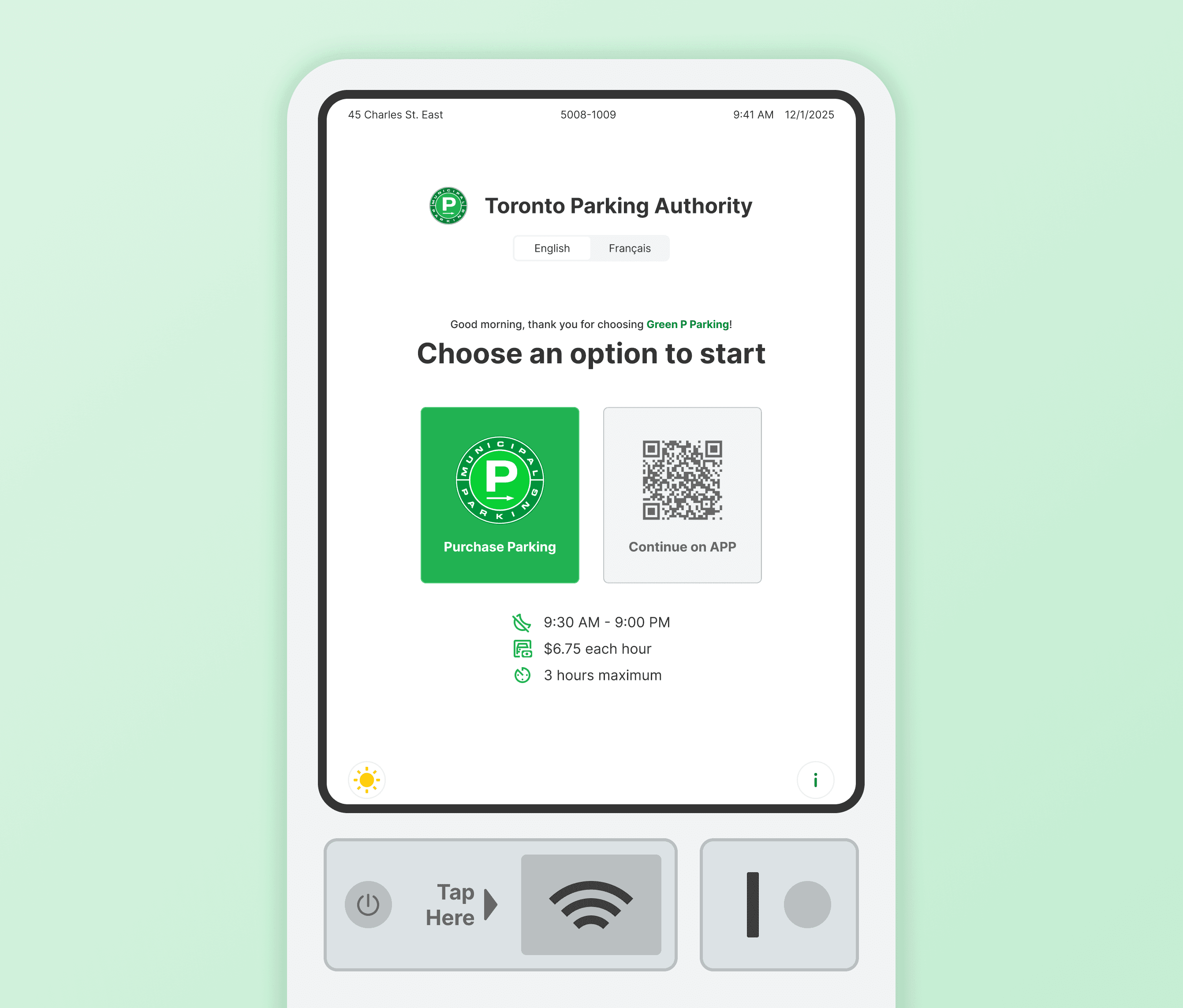
Prototype
This is the clickable mid-fidelity prototype I designed for usability test.
Ideas leave for the future
These are some ideas we generated for this project, but we believe it is better to leave them for the future.
